Design Considerations for Data-Dense Interfaces
February 27, 2026
Read on Medium →Lately, I've found myself working almost exclusively on data-dense interfaces. This is everything I learned from that experience.
The project that taught me the most is the Fermi Data Dashboard; an effort to consolidate the diverse data sources and storage systems across Lamar University. I was brought in to design the frontend, with a specific challenge: make it usable for people who aren't technical. That constraint shaped nearly every decision I made.
Designing for Two Audiences at Once
The hardest thing about this project wasn't any single design problem, it was the tension baked into the brief itself.
Researchers who built the underlying systems needed access to raw data, column-level metadata, and ML configuration options. Administrators and non-technical stakeholders needed to load a dataset and understand what was in it without reading a single line of code. These two groups were going to use the same interface, and designing a single experience that served both without frustrating either required a lot of deliberate layering.
The instinct in these situations is to build two separate interfaces. A "simplified" mode and an "advanced" mode. I think that's usually the wrong call. It doubles your maintenance burden, creates inconsistency, and, more importantly, it assumes you know which bucket each user belongs to. In practice, people move between modes. A researcher might be doing exploratory work one day and presenting findings to a committee the next.
What I found works better is designing one interface with a strong default state that protects non-technical users, while keeping depth accessible without it being in the way. The key is to lead with complexity and not hide system capabilities.
The Sidebar: Small Decisions That Compound
A sidebar is a universally understood pattern. Users expect it to handle app-level navigation — select something there, and the main panel responds. Simple enough. But one problem surfaced quickly: most of the datasets being uploaded had names like kpi_universities_SETX_2026.csv, and horizontal space in a sidebar is precious.
The default behavior, truncating from the end, gives you something like kpi_universiti…, which is nearly useless. What I did instead was truncate just before the file extension: kpi_unive...csv. In a data dashboard context, knowing the file type matters more than reading the full middle of a filename.
It's a small thing. But in a data-dense interface, small things compound in ways they don't elsewhere. When users are processing a lot of information at once, the cognitive cost of a confusing filename, a misaligned label, or an inconsistent spacing rhythm adds up faster than it does in a simpler product. Every friction point is load-bearing and fixing one isn't just fixing one.
That insight changed how I approach this kind of work. I spend more time on the details than I used to, not because I'm precious about them, but because I've watched the research. Users navigating dense UIs are closer to their cognitive limit. They have less patience for the things that, in a lighter product, they'd shrug off.
Information Hierarchy When Everything Feels Important
One of the structural challenges of data-dense design is that the information actually is really important. In a marketing landing page, you have one job: guide the eye to the CTA. Everything else is support. In a data dashboard, a researcher might need the column summary, the visualization, and the raw table value simultaneously and there's never an obvious primary action.
The temptation is to make everything equally visible and the result is that nothing is.
What I kept coming back to was the idea of visual gravity — designing so that some elements naturally attract the eye first, not by making them larger or louder, but by giving them more breathing room, stronger contrast, or a more resolved position in the layout. The rest of the interface can be dense, because users understand they're in a professional tool context. But they still need an entry point.
In practice, this meant resisting the urge to fill every pixel. That meant thinking of whitespace not as wasted space but as structural. It's how you communicate hierarchy without headers and callouts cluttering every section.
The Column Information Panel: Coherence Over Cleverness
User testing revealed something I hadn't anticipated: researchers wanted column-level detail. Is this column numerical? Categorical? What's the most frequent value? The average?
To address this, I designed a detailed column information panel that surfaced all of that; data type, frequency, averages, and more. The feature I'm most proud of is the automatic mini charts that populate for each column, synchronized with the horizontal scroll of the data table above. The two sections scroll together, so users never have to manage them separately.
The synchronization might sound like a nice-to-have but in practice it ended up being load-bearing. Without it, users have to mentally track their position in one panel while navigating the other — a form of split attention that gets expensive fast in an already demanding interface. When the two panels move together, that cost disappears. The experience feels more cohesive instead of assembled.
This is a pattern worth internalizing: in dense interfaces, the interactions between components matter as much as the components themselves. A beautifully designed data table and a beautifully designed column panel are not, by default, a beautifully designed experience. The seams between them have to be designed well too.
Progressive Disclosure: The Most Powerful Tool in Complex UI
Progressive disclosure isn't a new idea in UX — it's the practice of revealing complexity gradually, keeping the simple path front and center until the user actually needs to go deeper. TurboTax is the canonical example. Whatever you think of their business model, they built a product people genuinely pay for, and the core of it is making something genuinely complicated feel manageable. You don't see every tax form at once. You answer one question, then the next, and the complexity is metered out in proportion to what you've already understood.
I think about this principle more than almost any other when working on complex interfaces, because it resolves a tension that otherwise feels intractable: how do you build a tool that's powerful enough for experts without being alienating to everyone else?
The answer is sequencing instead of an attempt to dumb down.
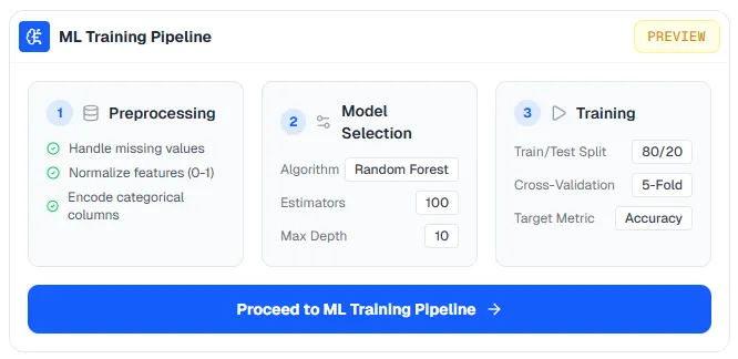
I applied this to the machine learning section of the dashboard. We were integrating a lightweight LSTM training pipeline, and my early instinct was that surfacing all of that complexity in the main dashboard would be a mistake. Hyperparameters, preprocessing options, training configurations — dropping all of that on a researcher who just wanted to run a model would kill the experience fast.
So I split it: the main dashboard shows a clean preview, and when users are ready to go deeper, they move to a dedicated screen built specifically for the ML workflow. Everything they need is there: the training suite, the hyperparameter controls, but it's not in the way until they want it.
What makes this work is that the preview state is genuinely useful. A user who never clicks through to the ML screen should still get value from the dashboard. If progressive disclosure is just a loading screen for the real interface, it fails. The shallow layer has to stand on its own.
This applies everywhere in complex product design, not just ML pipelines. Filters, advanced settings, secondary actions — anything that serves a subset of users at a subset of moments is a candidate for progressive disclosure. The question to ask is: what does the median user need in this moment? Lead with that. Then make the path to everything else clear and available.
Built-In Visualization: Removing the Context Switch
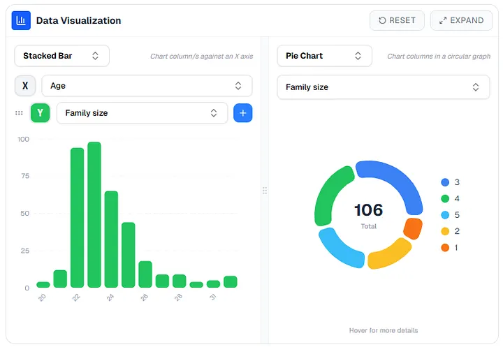
One pattern I kept seeing in user research was researchers writing the same visualization code over and over. Bar charts, scatter plots, pie charts — the usual suspects, every time, from scratch.
The problem wasn't just the time cost but also the context switch. Every time a researcher has to leave the platform to visualize their data — open a Jupyter notebook, upload to a third-party tool, write boilerplate — they're breaking a working state. They lose their flow. The tool stops feeling like a workspace and starts feeling like a filing cabinet.
Bringing visualization into the platform directly closes that loop. The charts live next to the data that generates them. Changes to the data are immediately reflected and because the visualizations are connected to the platform's data model, there's no import/export friction.
I also added full-screen mode and reset controls to the visualization and map views. This was a deliberate choice around control. When users feel like they're genuinely in command of a tool — when they know they can explore without breaking anything, and recover from mistakes without effort — the cognitive load of using that tool decreases.
Map View: Letting the Data Speak Its Own Language
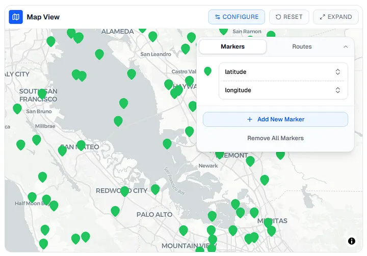
A significant portion of our datasets include latitude/longitude or GPS coordinates. Plotting those as rows in a table is technically correct and practically useless. The spatial relationships that matter don't show up in a spreadsheet.
To handle those, I designed a dedicated map view that lets users select which columns to use for plotting markers and routes. No code required. The goal was to let the data speak in the form that was most natural for it — geographic data belongs on a map, distribution data belongs in a histogram, time-series data belongs on a line chart.
This is a small philosophical point but an important one: the best interface for a given data type is the one that makes its underlying patterns most legible.
What Came Next
Maintaining a large design system solo, gathering requirements, and watching the platform come together over time, it's been a long process. And I'm genuinely proud of what it became.
But somewhere along the way, I realized I was a better designer than when I started. A blog post didn't feel like enough to show what I'd actually learned. So I built something else.
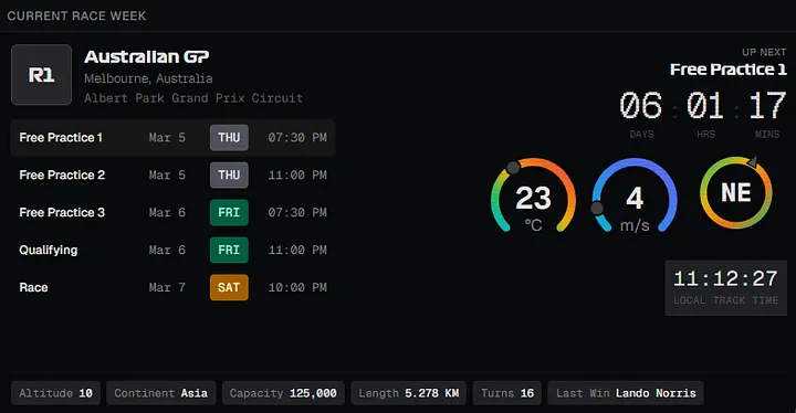
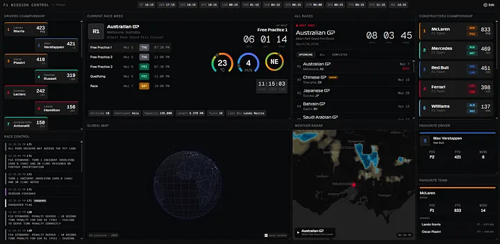
F1 Mission Control is everything I absorbed about data-dense interface design, channeled into a NASA-inspired dashboard for Formula 1 fans. It's the project where I got to take the craft seriously for its own sake, no stakeholder requirements, no dual audience problem, just the design. Check it out at f1.namansubedi.com.