Badge
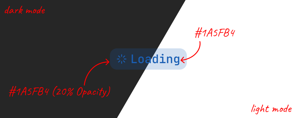
The color should come through in the label and icon first. Both use the full color, and the background uses it at 20% opacity. That gives the badge a visible shape while keeping the strongest color on the parts I read.
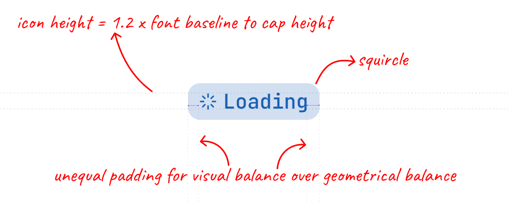
The icon should hold its own next to the label. I like it a little taller than the capitals in JetBrains Mono, with its center lined up with theirs. Every icon gets the same amount of space, so swapping an arrow for an X keeps the badge the same width. With an icon only on the right, a little extra room on the left keeps the label from feeling pressed against that edge.
Leading icons should only convey information, and trailing icons should always perform an action. A leading check or loader communicates status. A trailing X can remove a chip, and a chevron can open a popover. When those roles are consistent, I can tell which icons are clickable by where they sit.
A badge often tells me the status of something that can change, like a file going from uploading to ready. I want to catch that change without having to stare at the badge, so the old icon softens before it fades and the new one comes into focus. If the icon goes away entirely, the badge waits for it to fade before closing the space it leaves, so the label moves with the edge. When the color changes, a brief sheen sweeps from left to right, carrying the new color across the fill, label, and icon together.